
Types of Visualization Functions
The main types of visualization's available in Paraview are:
Contour
Clip
Slice
Threshold
Extract Subset
Glyph
Stream tracer
Dataset Controls
Data Controls
Paraview can handle multiple datasets loaded at the same time which is helpful when comparing two solutions.
With any of the visualizations below, the active dataset for the function can be selected. To access the active dataset, right click on the function in the pipeline browser and select dataset.
Legend Control
The legend control is located on the toolbar and in the object inspector under the properties tab. The legend is specific to the dataset in which it was first activated so be careful when manipulating the views and datasets once the legend is active on the display.
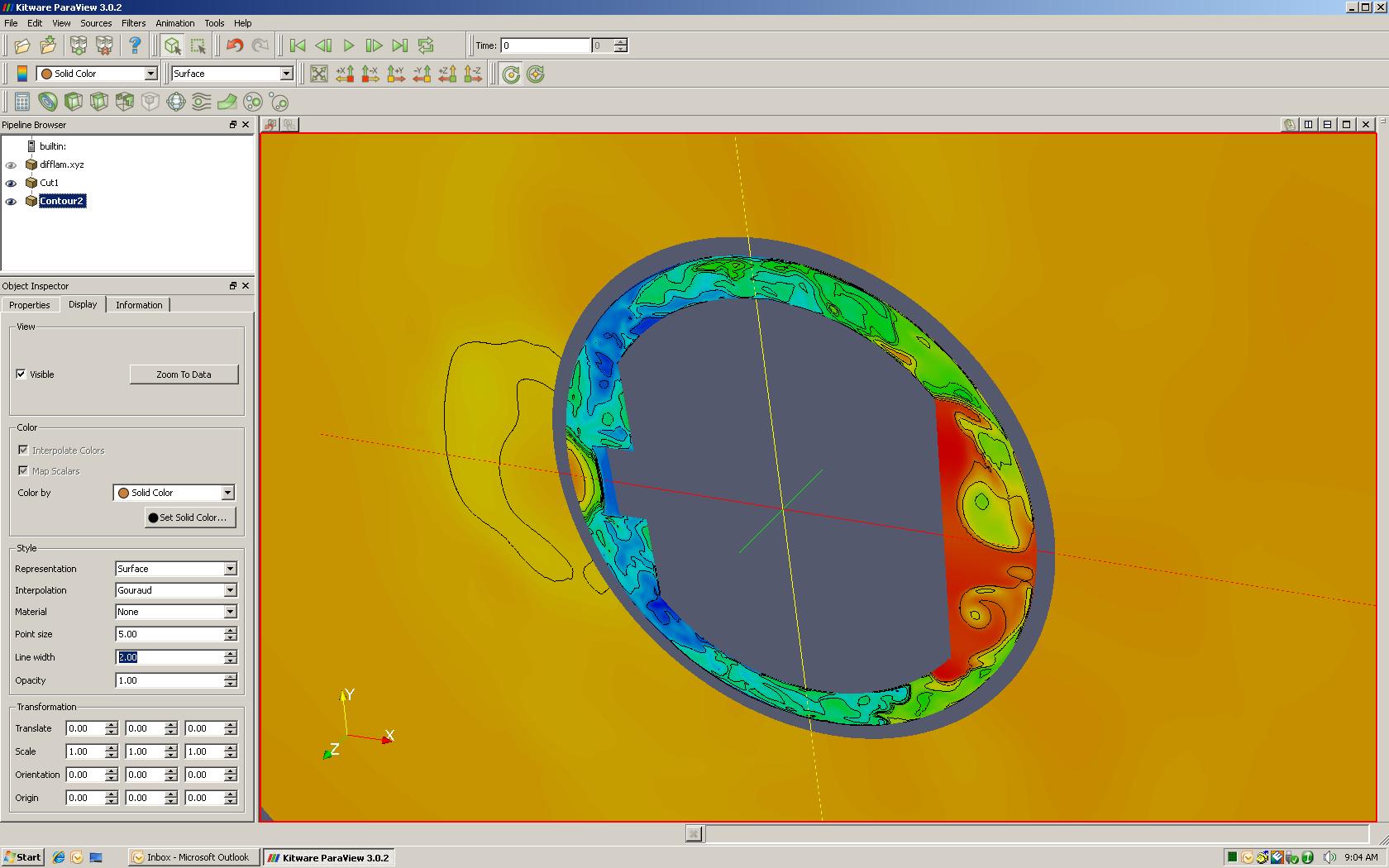
Contour
Contour limits the dataset to show various regions that fit within certain groups of data. This data is often segmented by lines which denote the location where two groups of data meet. In 2D, this looks similar to a temperature map often displayed in the news forecast. In 3D, a contour will yield a similar result created by a threshold plot.
In this example, the contour was applied to an active slice that was already created. The contours greatly accent how the various regions appear.
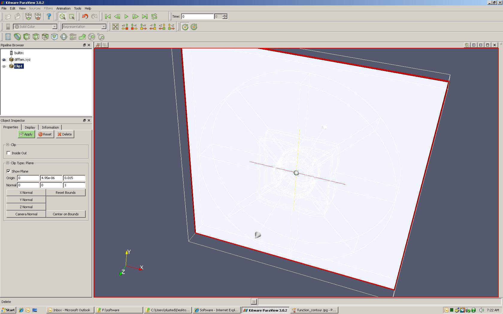
Clip
A clip is similar to a slice except it leaves a portion of the entire geometry behind.
To create a clip, press the clip button located on the toolbar and a visual plane will appear in the graphics window to illustrate where the plane will be located. This plane can be manipulated by selecting the x, y, or z normal from the properties tab, or by using the mouse pointer and selecting the red edge or axis marker.
** Plane manipulation is identical for all functions in Paraview.
Once applied, the slice will be created.

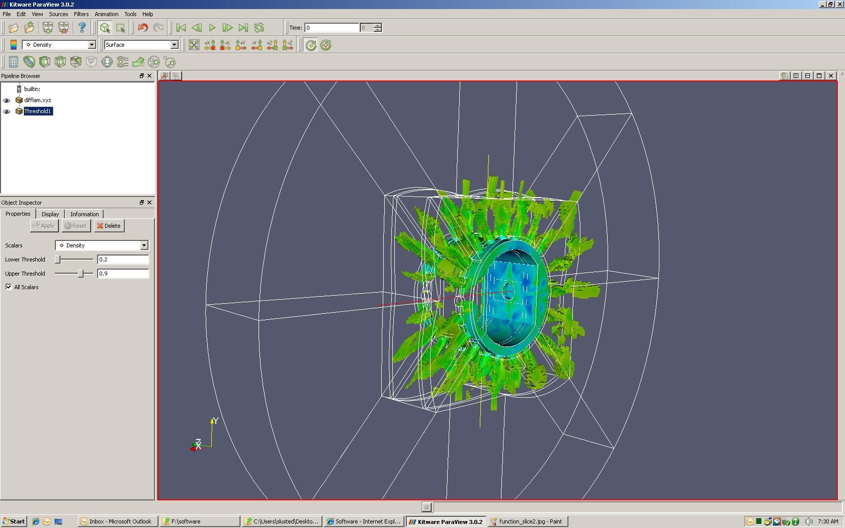
Threshold
A threshold is used to limit the display to only data that falls within the prescribed range. It is useful when trying to locate or understand where certain property values are located within a given solution.
The example belows is displaying the region of the solution that has a density between 0.2 and 0.9.
Extract Subset
Extract subset allows the solution to be limited based on grid parameters. In this example, a structured grid was used and can be controlled by the i,j,k.

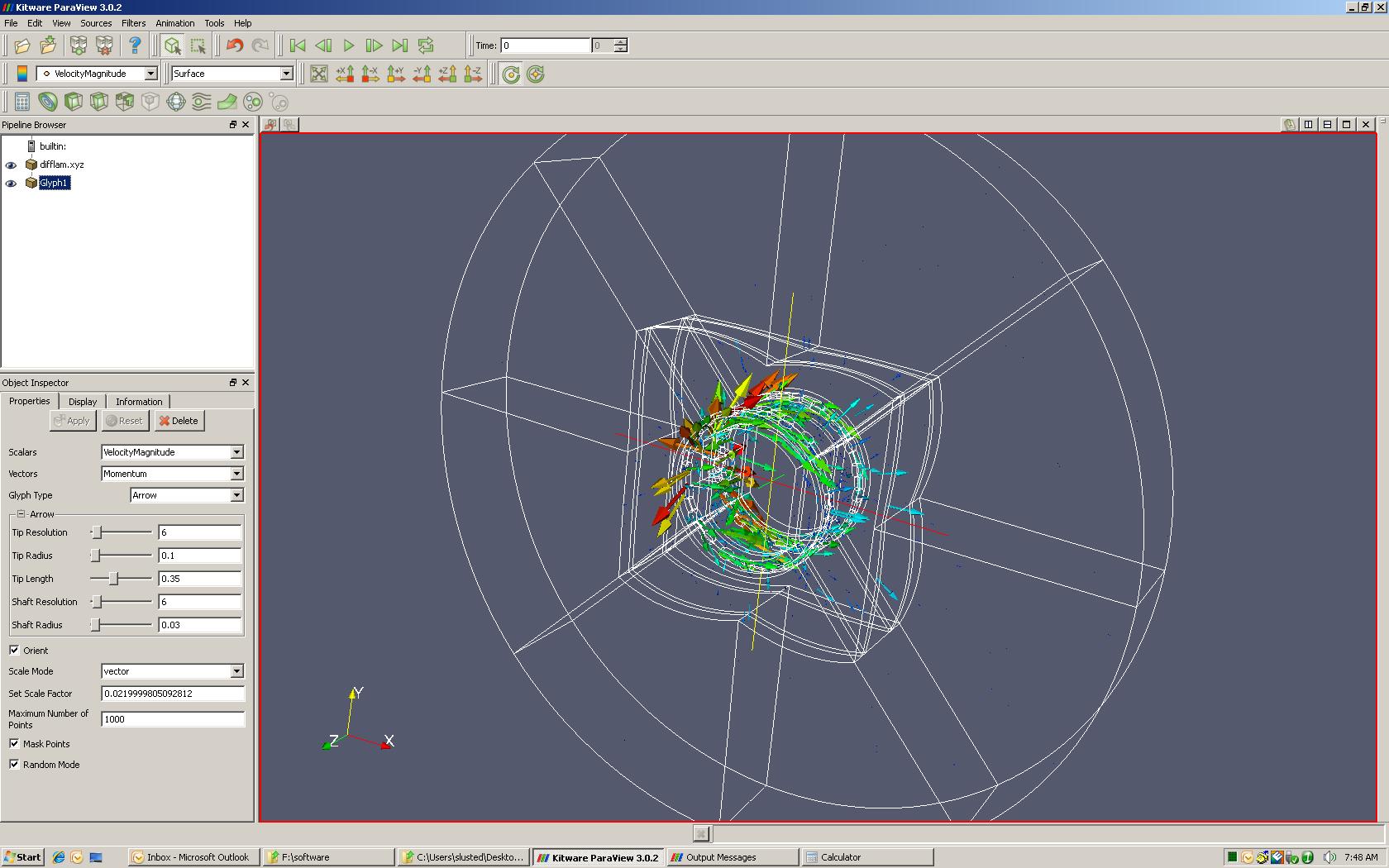
Glyph
Glyph is used to create vector plots in the domain. There is a large assortment of vector styles available coupled with endless ways to view the data. For this function, the following inputs are key:
Scalars: Value used to determine relative size of vector
Vector: Dataset used to compute the vector direction
Scale Mode: The scaling can be controlled depending on what is desired
The coloring scale applied to the arrows is controlled in the display tab.
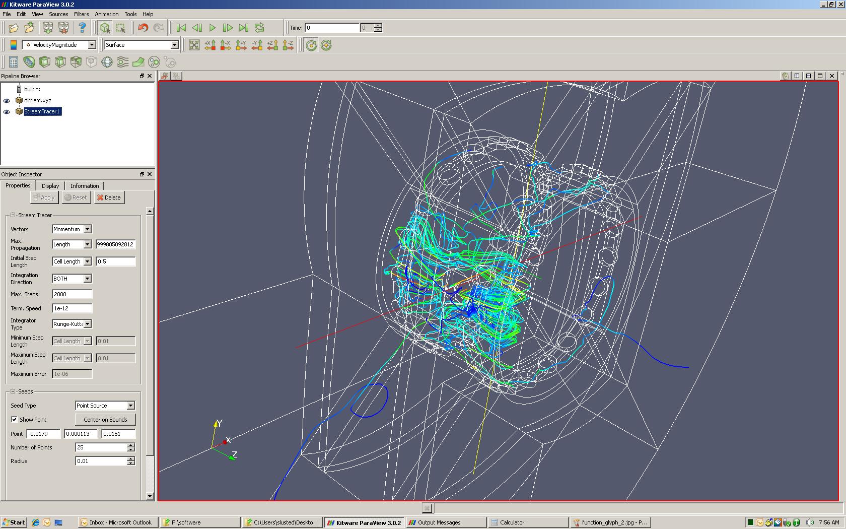
Stream Tracer
Stream tracer creates particle traces based on the starting location. The properties tab controls the calculation portion of the stream tracer. The key settings are:
Vectors: Dataset used to calculate particle path
Integration Direction: Depending on how you want to look at the paths, this can keep the trace paths clean by only picking one direction
Seeds: Selects the starting point for the particle
Point source: Select a center point in which the number of points will be distributed around a given radius
Line source: Select a line in which the number of points will be distributed along.
Dataset Controls
Dataset controls are used to limit or adjust the portions of the model that are to be displayed at one time. This portion is more useful for unstructured grids where the grid can be limited based on family names created in the domain file.